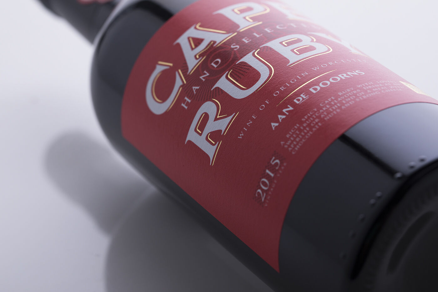
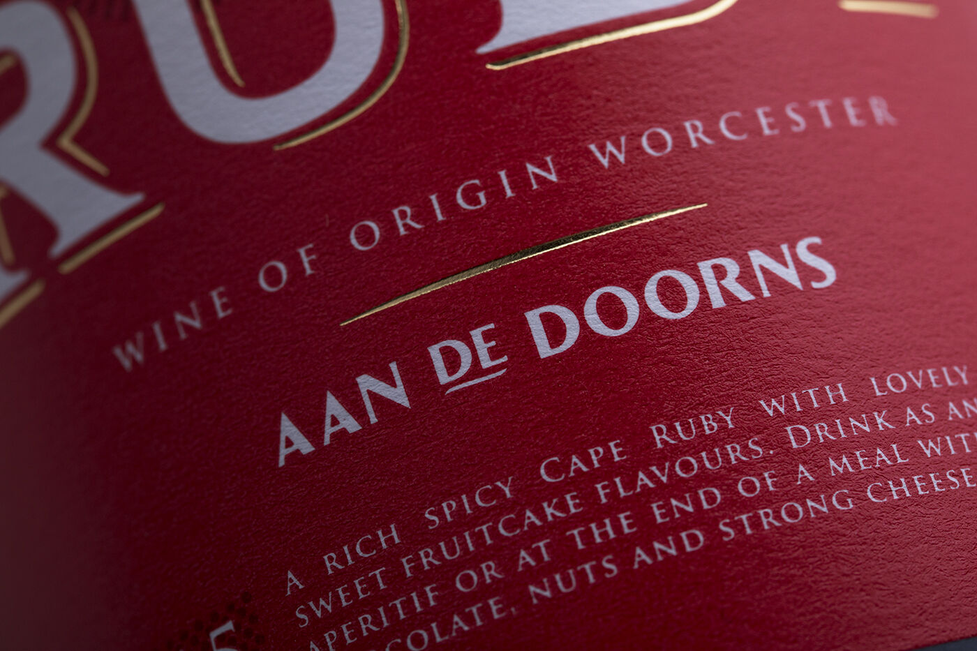
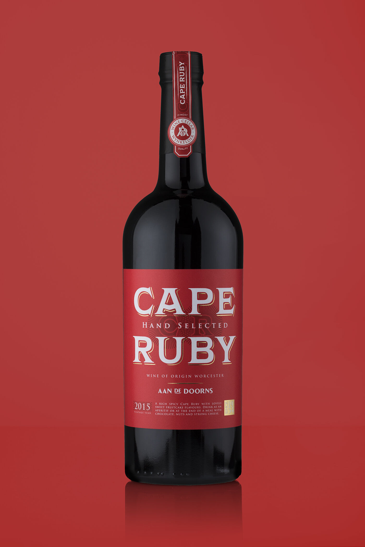
Cape Ruby – Port

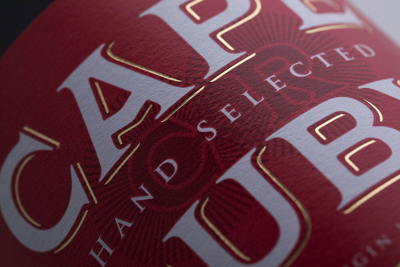
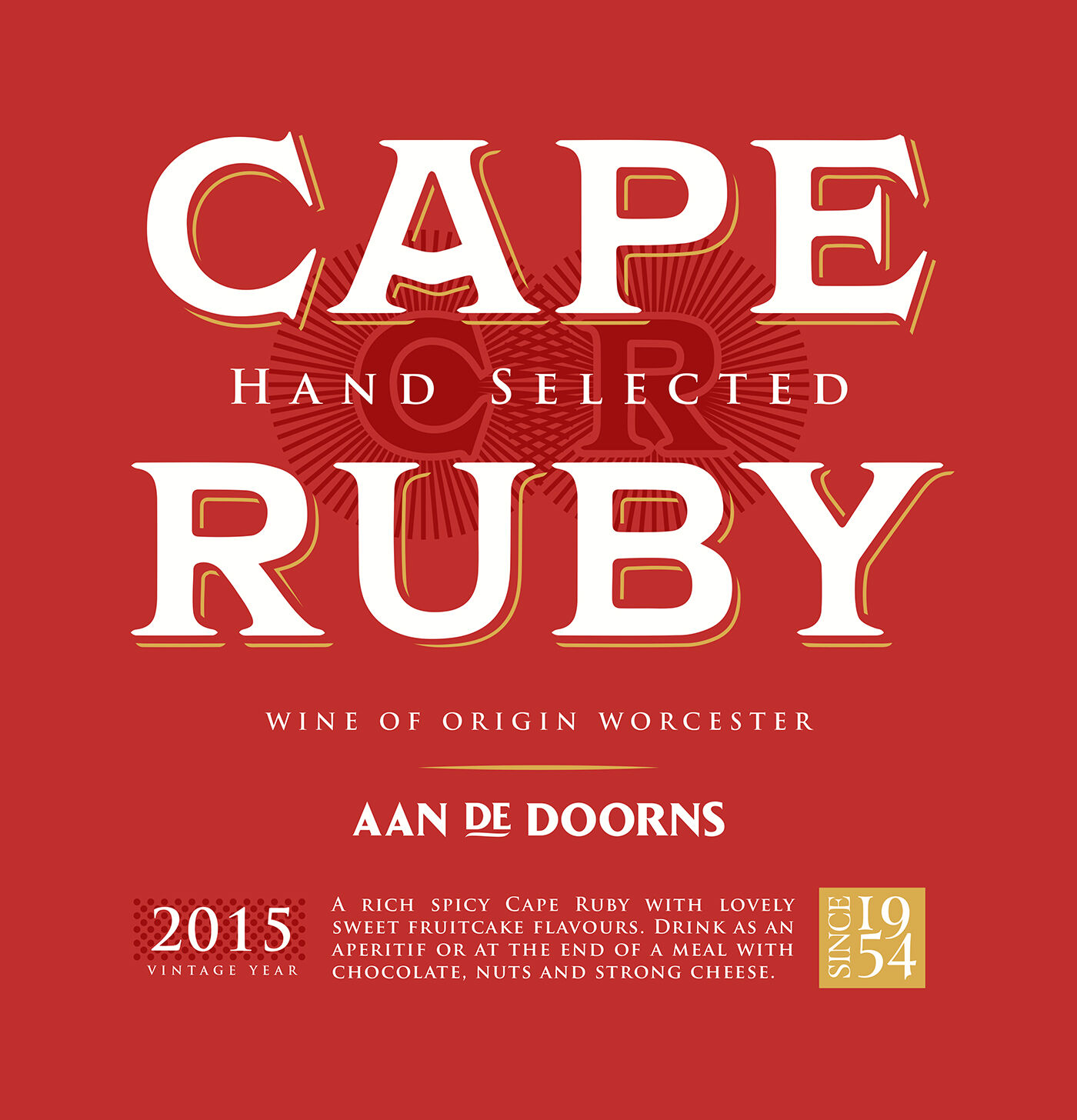
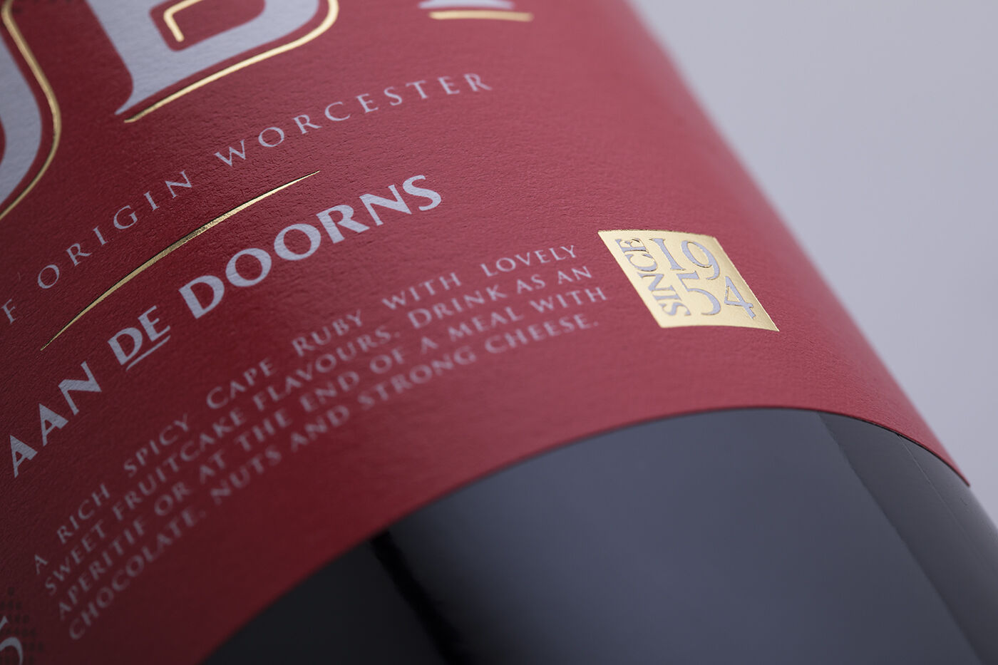
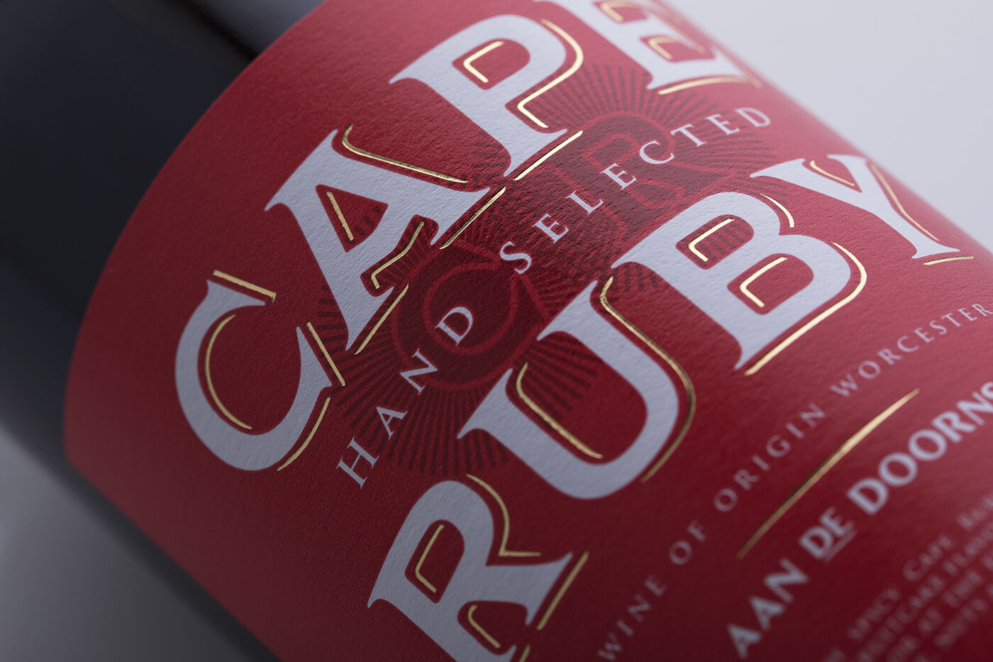
Aan de Doorns cellar has been producing fine wines since 1954. Their Cape Ruby Port label was more recently revitalised. The redness is bold and distinctive, while the gold foil stamping makes for a striking shelf presence.
At launch, the port’s new packaging was greeted with enthusiasm from distributors and clients. The estate reports that it also added to demand – meaning increased production and distribution, with profits well in the black.

Immediately after its launch, the revitalised Cape Ruby packaging was met with enthusiasm from distributors and key accounts. The new contemporary look allowed the winery to raise pricing, increase production and expand distribution.

Frederick

Cape Ruby – Port

  • Year

    2021

  • Roles

    Packaging designer

  • Tools

    Illustrator

  • Themes

    Beverage

  • Medias

    Packaging

Frederick

Publications and awards

Pentawards Award, The Dieline Award, World Brand Society Award (studio of the year), D&AD Yellow Pencil, Art Directors Club Award, Cannes Lions Award, Novum Magazine – Cover, AIGA, Logo Lounge 6, Logo Lounge 4, Master Series, Package 04, Package 06, Loerie Awards, Tabpi Awards, Creative Circle, Lüerzer’s Archive Packaging Designs

Brands

Nike, Virgin Money, Ackermans, Woolworths, Deloitte, Price Check, Castle Lager, Black Label, Jax Panik, JSE, Red Heart Rum, DHK Thinkspace, V&A Waterfront, Lifta Chair lifts, Pick 'n Pay, TFG - The Fochini Group

collaborate with Frederick

An idea? A project?
Simply drop us a line to chat about it, and we’ll shape together the right solution for you.

brief his agent