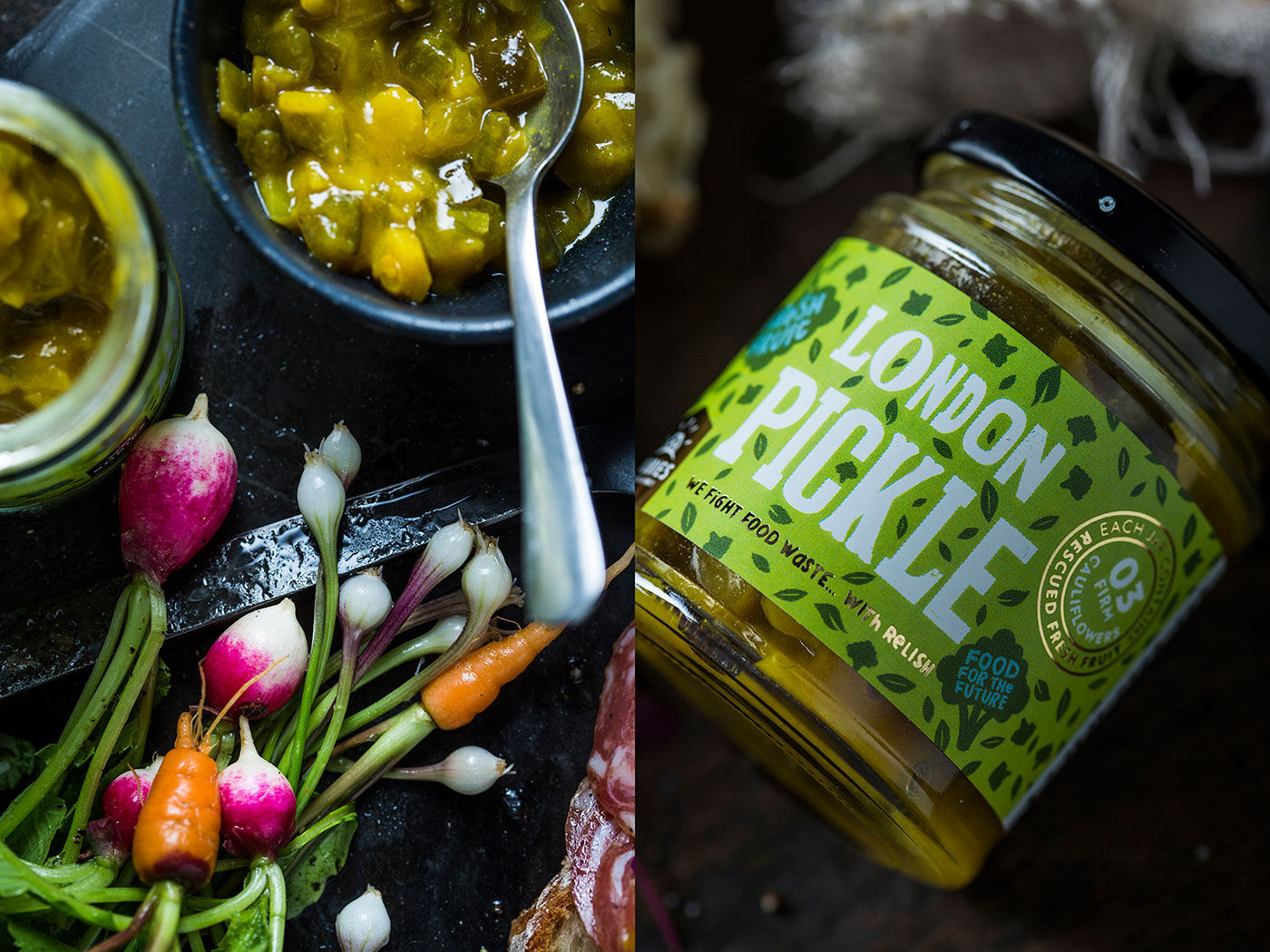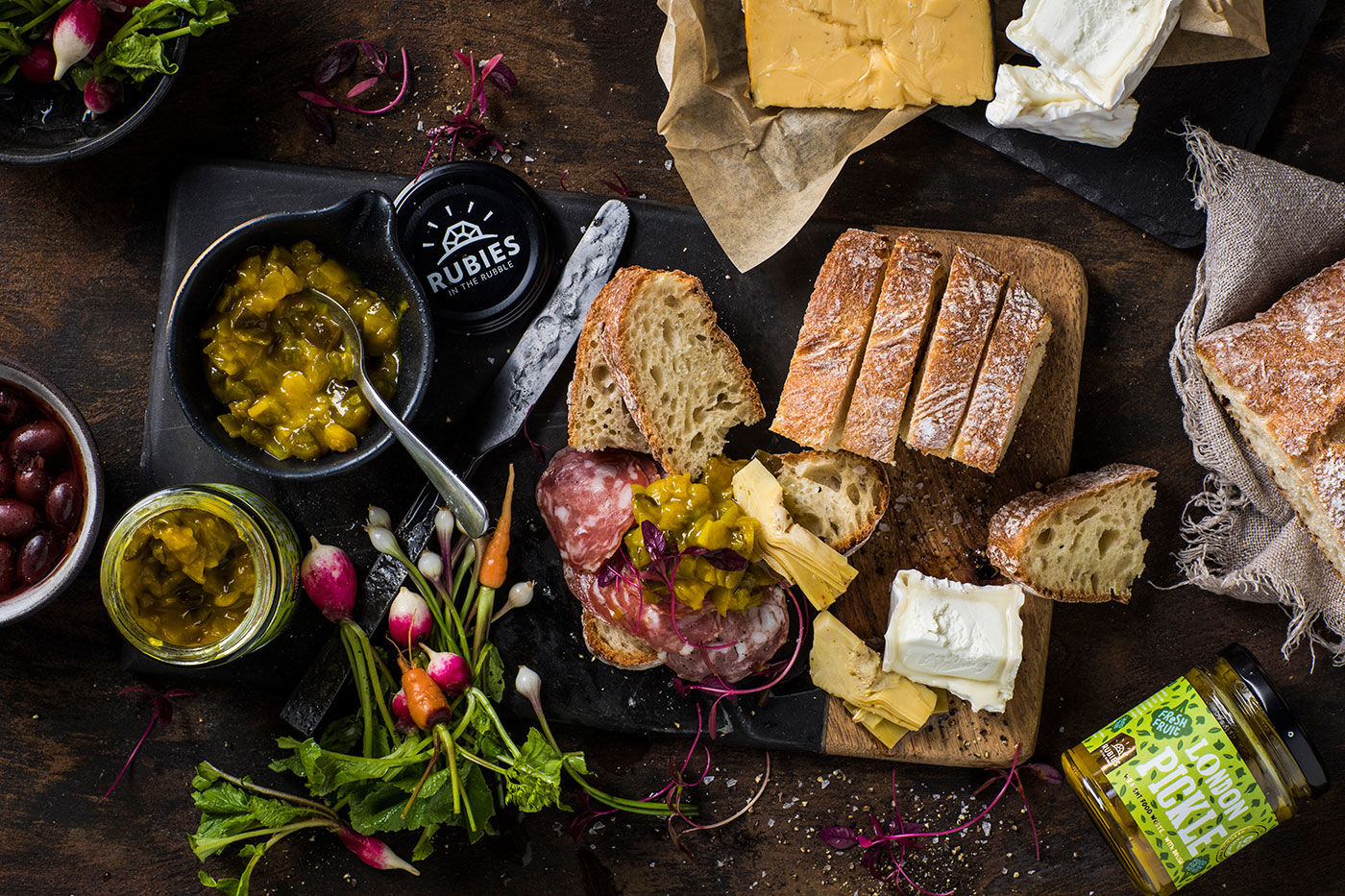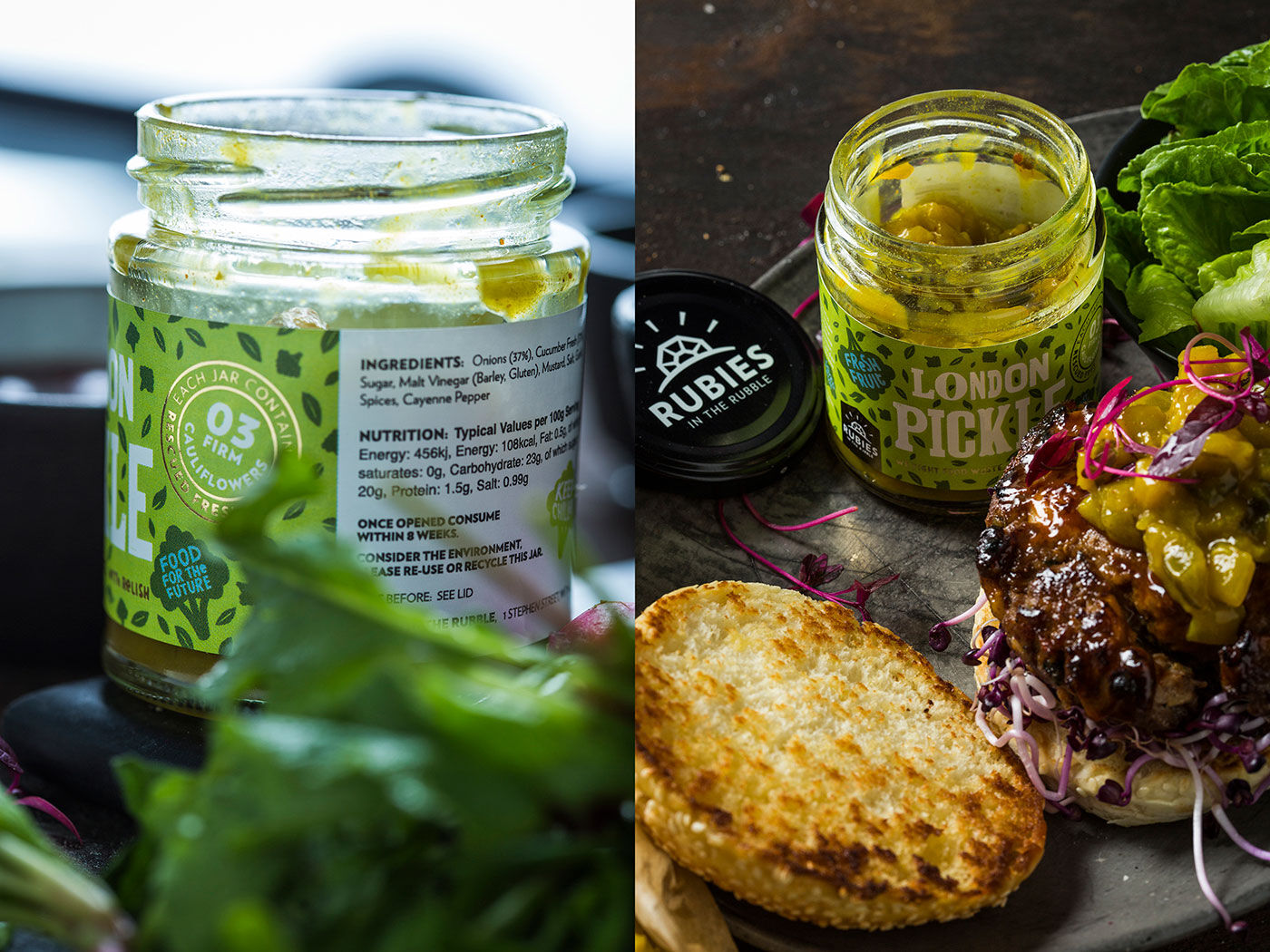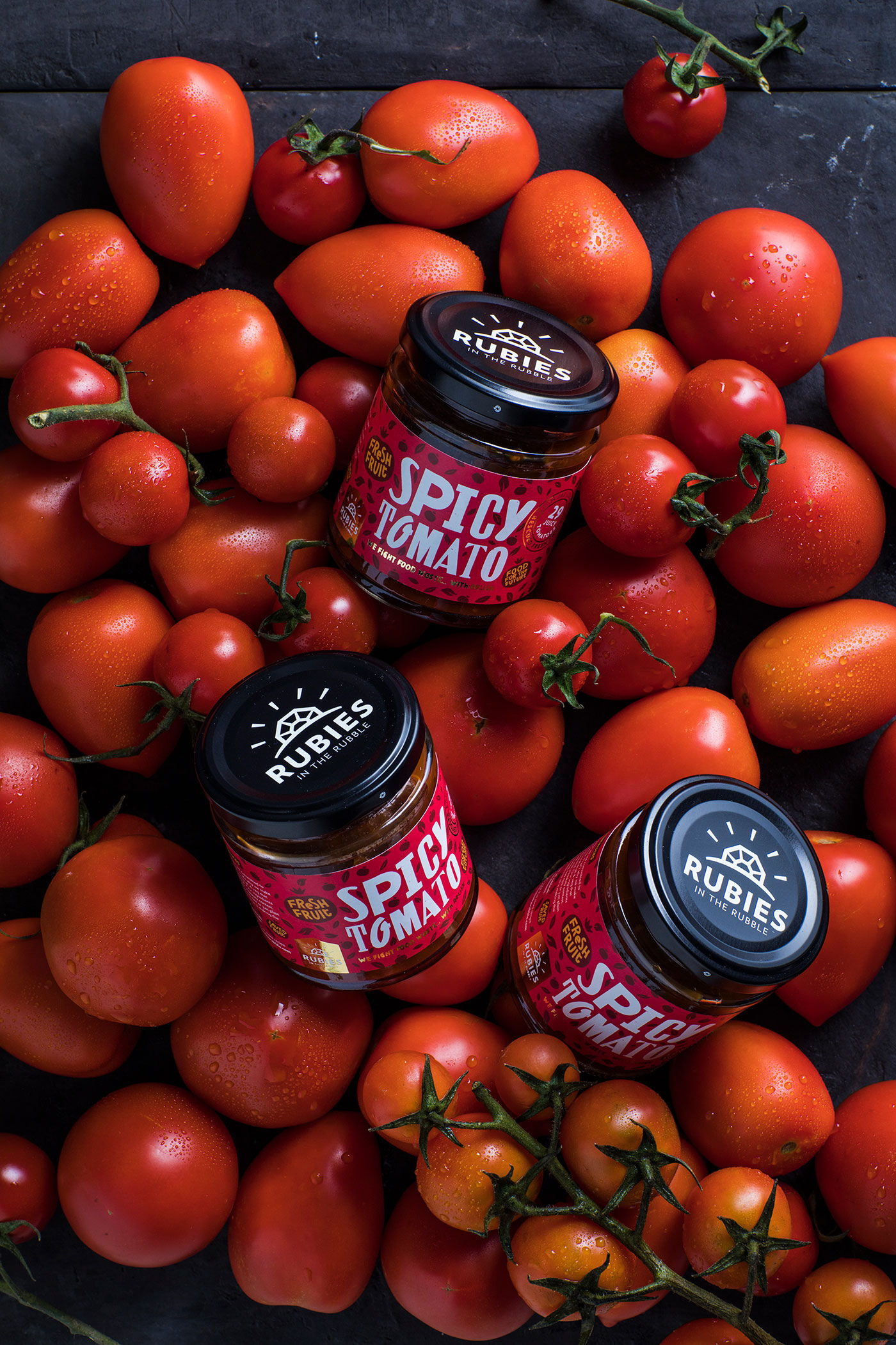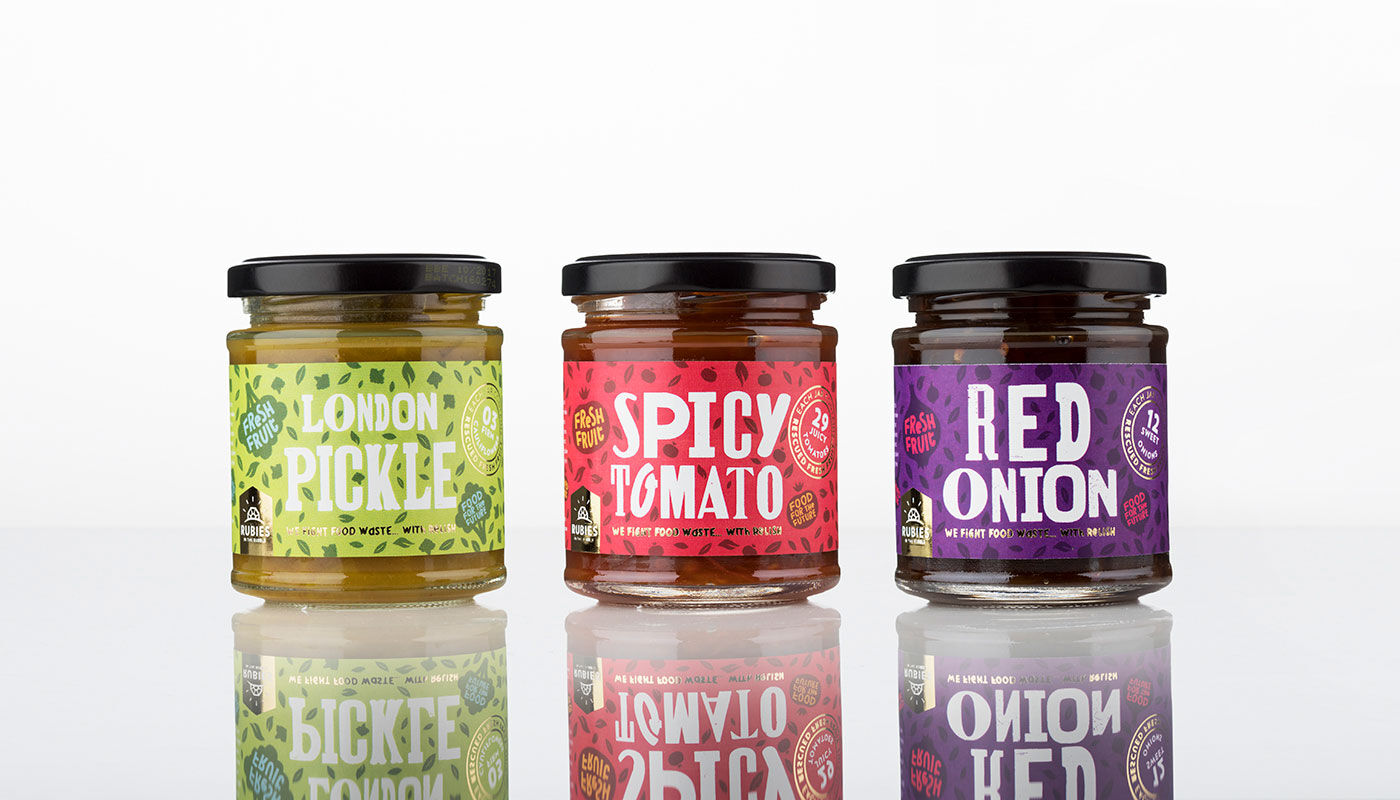
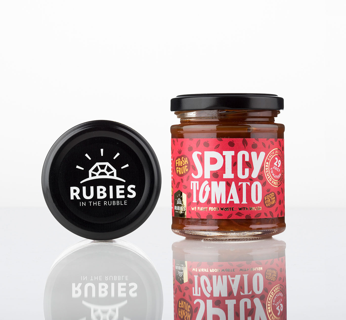
Rubies in the rubble
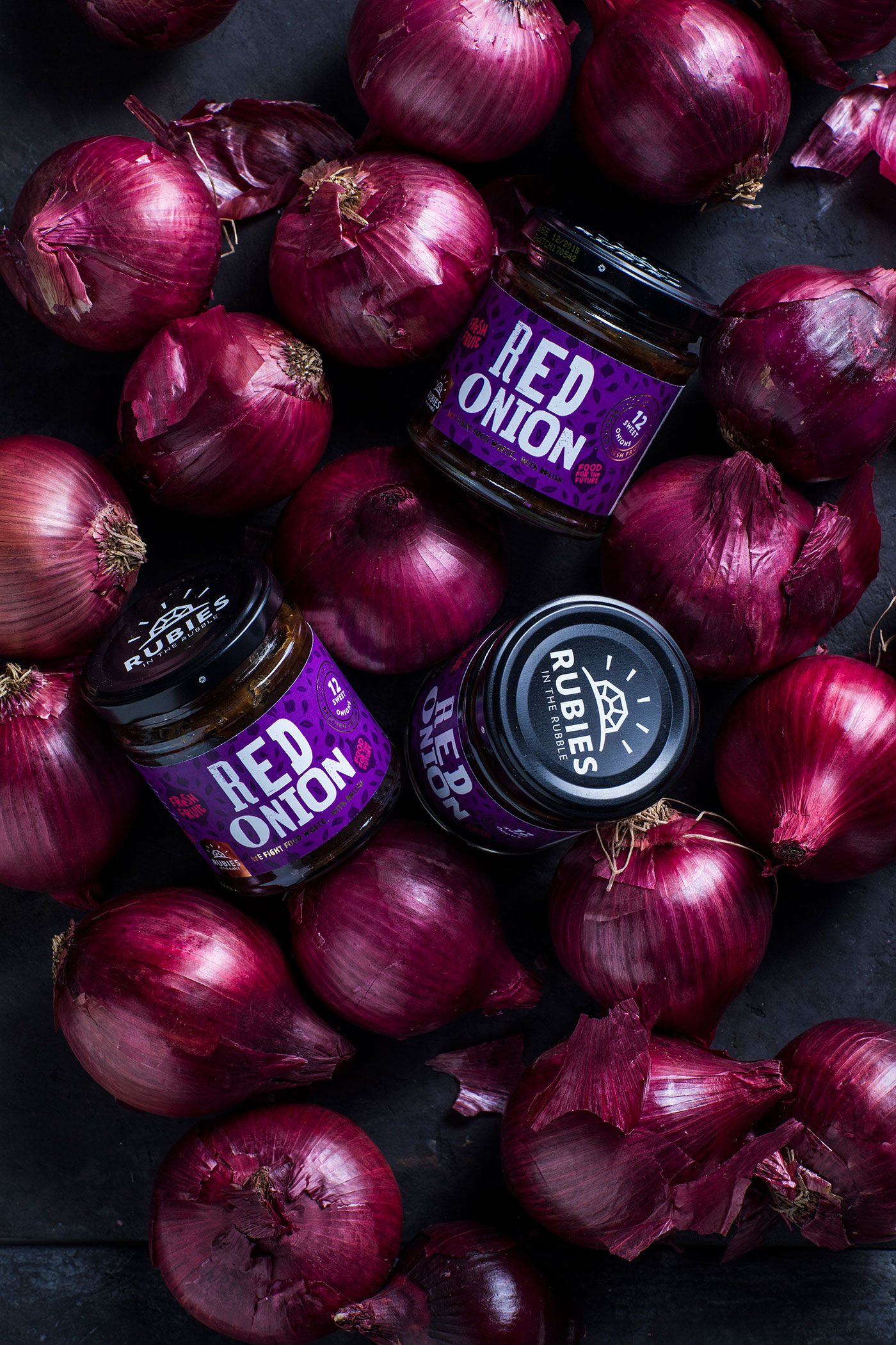
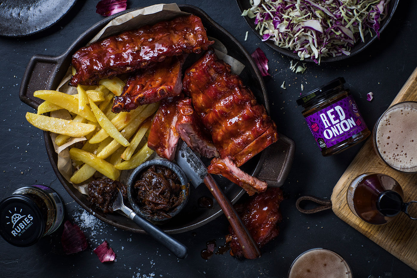
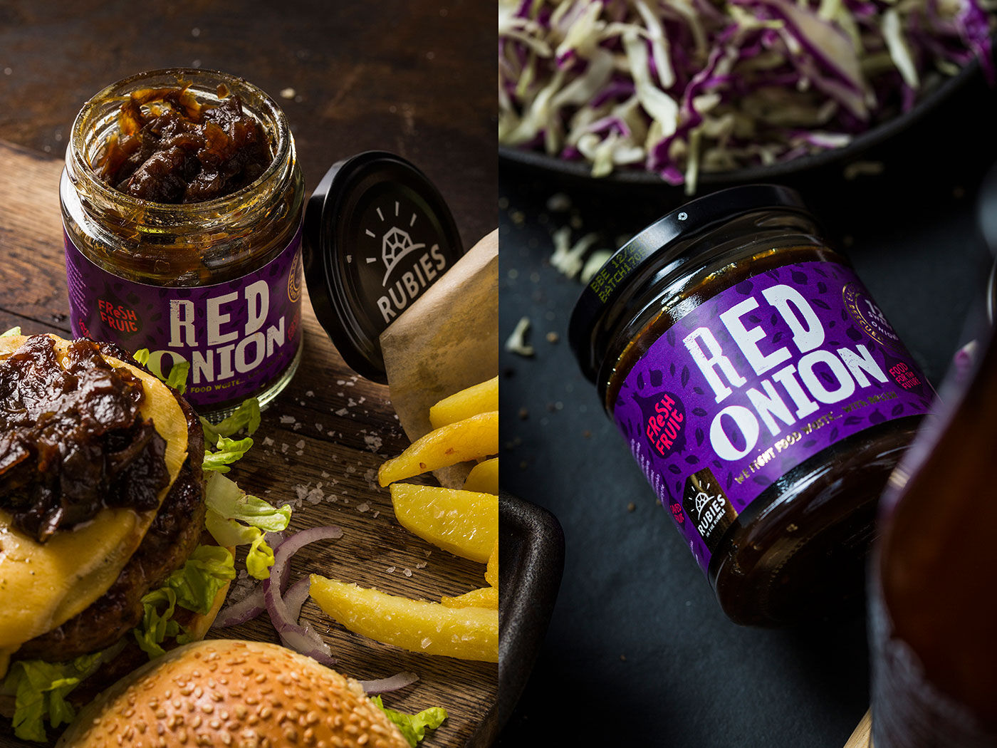
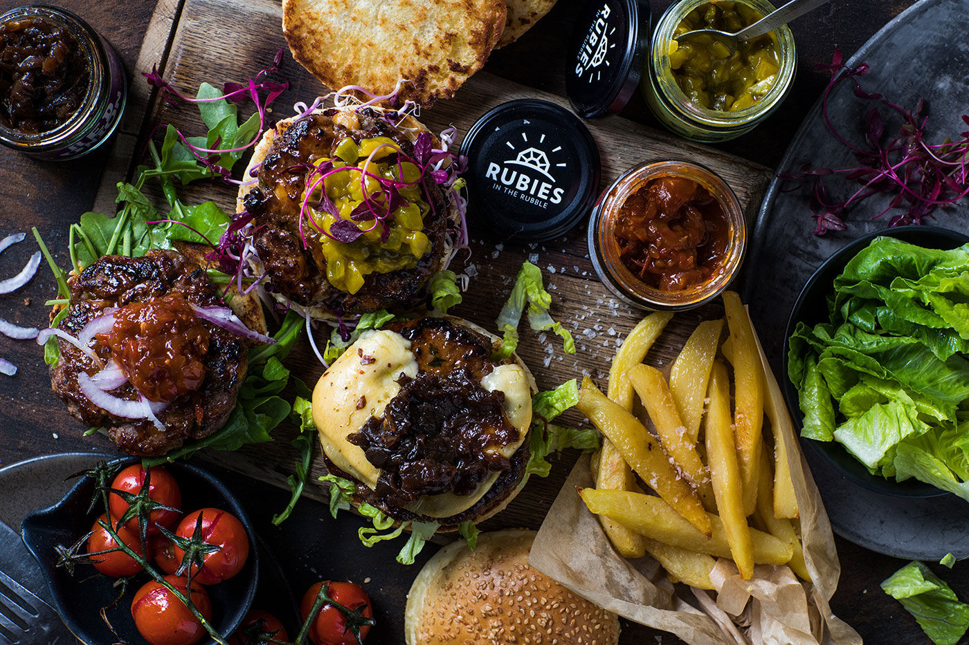
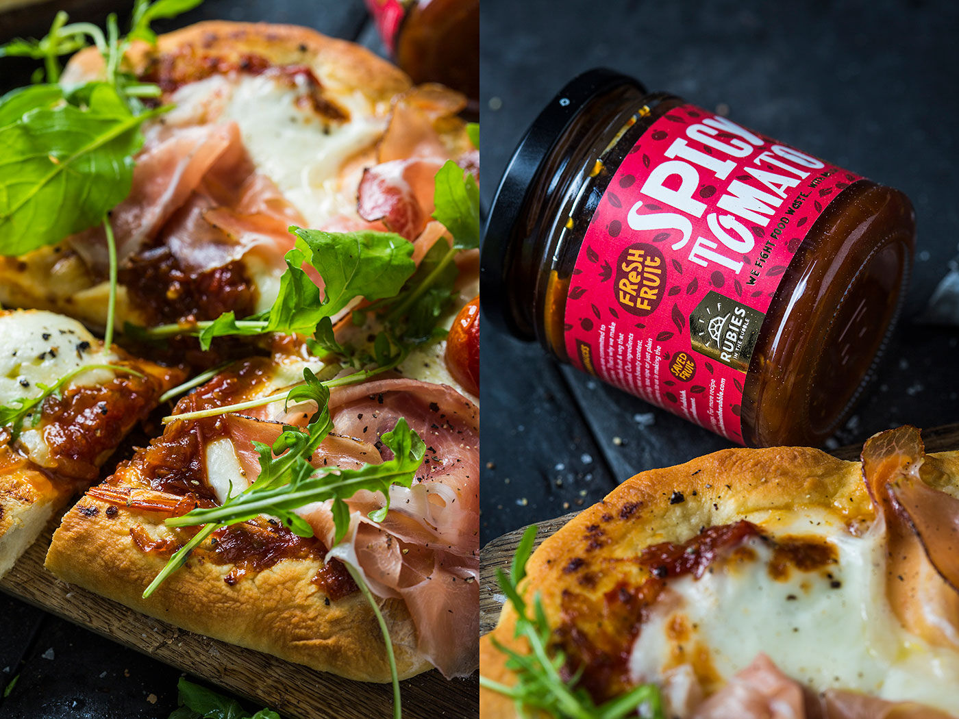
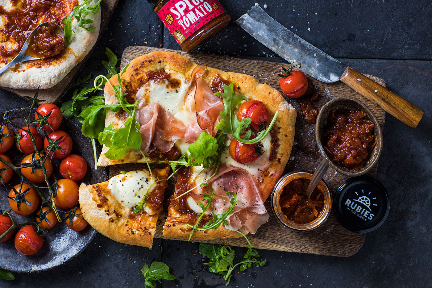
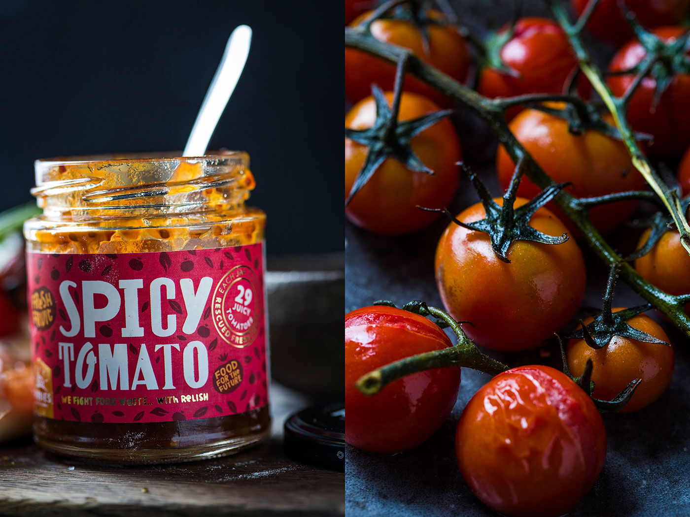
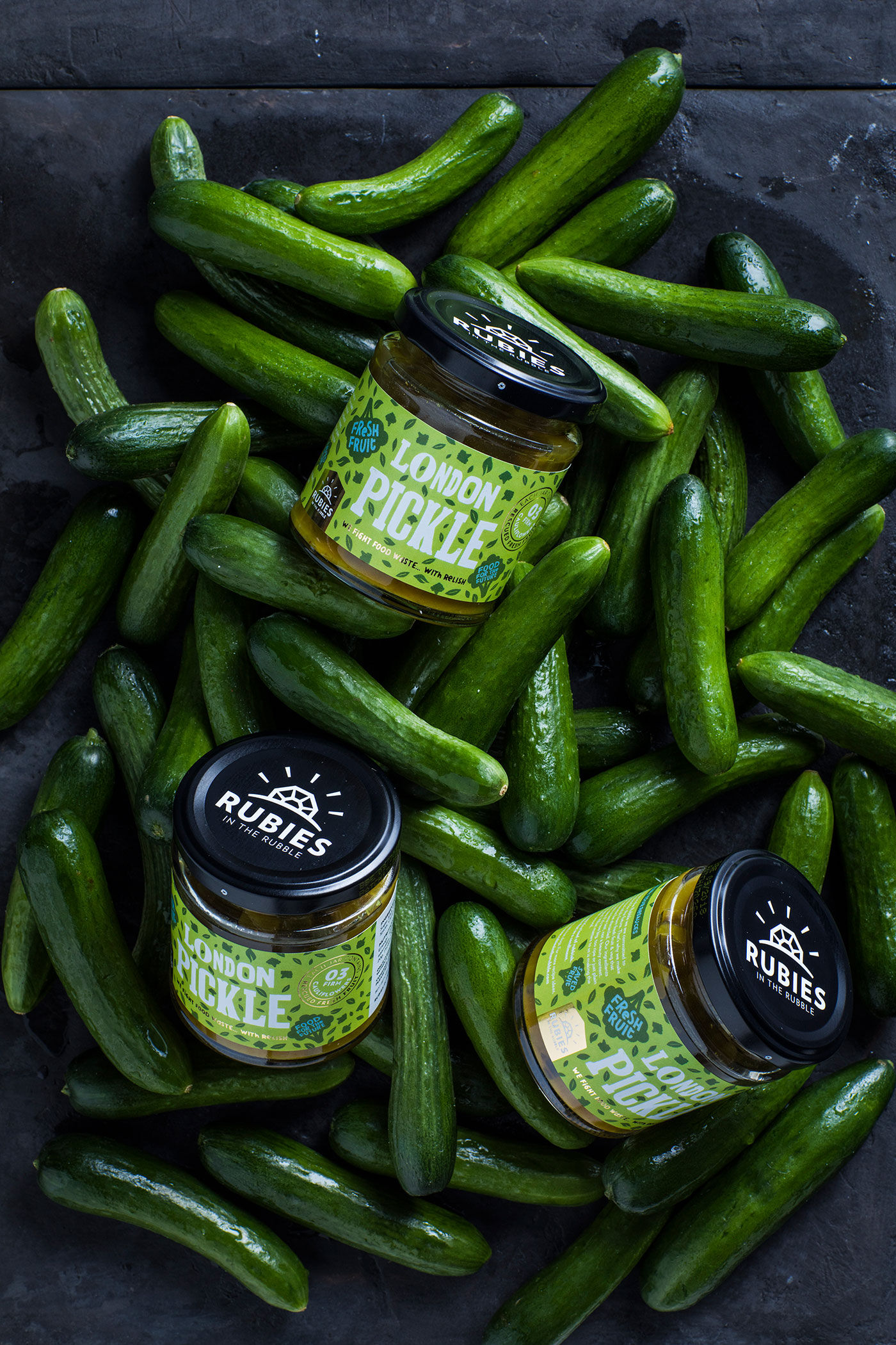
What happens to fruit and veg that are the ‘wrong’ shape or size to appear in store? Too often, they go to waste. Rubies in the Rubble rescues these ingredients, sustainably transforming ‘rejects’ into a range of delicious relishes. Their brand identity pays light-hearted homage to these ugly-beautiful, extra-ordinary beginnings. Typography is mixed and matched. Icons happily highlight special ingredients. And patterning pulls the whole riotous patchwork together. While the client ultimately went with a different label direction, we thought this was too good not to share!